The real problem with clinical trial site selection isn't finding rising stars
Clinical trial sites cluster around the same names EU-wide, not just in Hungary or Poland. What that means for how sponsors choose where to run a trial.
This is part 2 of a three-part series built on the same dataset: all 28 EU and EEA countries’ worth of clinical trial data, pulled through CTIS’s undocumented public API. Part 1 covers what the full register shows about Central Europe’s place in global pharma, including the site-concentration numbers this piece builds on. Part 3 covers how the pipeline itself got built, including the bugs a second, skeptical pass caught that the first one missed.
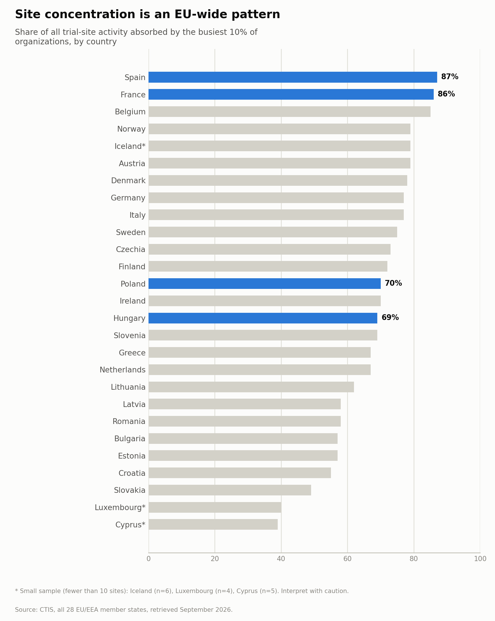
Across the entire EU clinical trials register, not just one country, the busiest 10% of trial sites absorb somewhere between 55% and 87% of all site activity, and the busiest 10% of investigators absorb 23% to 52% of investigator-trial links, depending on the country. Large markets and small ones land in roughly the same range. France and Spain, the two biggest trial markets in the register, show almost identical concentration to Hungary and Poland. This isn’t a quirk of any one healthcare system. It’s how multinational trial site allocation actually works across the whole EU.
If your instinct is that this sounds risky, you’re reading it correctly, and the industry’s own literature already agrees. Over-reliance on a small set of high-volume research centers is explicitly named as a liability, not a convenience: it constrains investigator availability, intensifies competition for eligible patients within the same narrow pool, and raises exactly the kind of generalizability concerns regulators like the FDA and EMA are increasingly focused on. More than half of clinical sites report struggling to take on new trials simply because they’re already at capacity.
The uncomfortable part: the concentration is partly rational
It would be convenient to treat a pattern this extreme as pure dysfunction, and it isn’t. A trial’s usable output depends on protocol adherence, and high-volume sites are experienced at exactly that: trained coordinators, standing GCP infrastructure, an ethics and contracting process they’ve run dozens of times, and a monitoring record a sponsor can actually check. Routing a study to a proven site is a defensible quality-control decision, not inertia. Anyone pitching site concentration as a problem waiting for a smarter search engine will lose that argument with the first feasibility lead they talk to, because that person picked those sites on purpose and can tell you why.
So the load-bearing point isn’t that concentration is bad. It’s that a rational allocation rule stops being rational at precisely the moment the preferred sites fill up, and nobody holds a current view of when that moment arrived. The two complaints the industry makes about itself here, over-reliance as a risk and over half of sites saying they can’t take on new work, are the same equilibrium described from opposite ends.
Why this isn’t really about finding new names
The obvious response to “the same sites keep showing up” is to go find new ones: rising investigators, under-used institutions, fresh capacity nobody’s tapped yet. That instinct is understandable, and it’s also not where the actual leverage is. The scarcity behind this pattern is structural, not a matter of undiscovered talent. In the US, only about 4% of healthcare providers do any clinical research at all, and the annual inflow of new physicians into clinical research has fallen from roughly 5% to under 2%. If that’s the picture in the largest, best-resourced trial market in the world, a thin, concentrated bench in any single country is the expected equilibrium, not an anomaly waiting to be corrected by a better search.
The pain point the literature does validate is different, and more useful: knowing real-time capacity, not names. Feasibility surveys used to select sites are typically static, manual, and often already outdated by the time a trial actually begins. Sponsors need a dynamic read on which sites and investigators have room right now, not a list of who’s prominent. That’s a live capacity and risk question, not a discovery problem, and it’s the one a current, complete national dataset can actually answer: how many active trials does a given site currently carry, and who else nearby could absorb overflow if that site is already saturated.
What this actually costs, and where those numbers come from
The concentration pattern above isn’t just a structural curiosity; it has a direct cost attached. A note on the figures that follow, because it matters more than the figures do: these are the standard numbers this market argues with, circulating widely through CRO and site-network literature, and most of them trace back through several layers of citation to a small number of original analyses. I’m reproducing them as the industry’s own working estimates, not as figures I’ve verified at source.
Roughly 11% of trial sites enroll zero patients, and another 37 to 40% under-enroll relative to plan. A single week a site sits unopened costs on the order of $390,000 in direct expense; a month of delay on a Phase III program runs past $1.5 million. Only about 47% of studies finish on their original timeline.
The tempting move here is to multiply the 11% by the weekly number and present the product as a saving. That would be dishonest arithmetic, and it’s worth explaining why. A site enrolls nobody for many reasons, most of which have nothing to do with how it was chosen: referral pathways that never materialize, patients who elect standard of care or simply don’t come back, insurance and financial clearance running longer than the enrollment window. A study of patients referred to a phase I oncology unit found the dominant reasons for individual non-enrollment sitting almost entirely on the patient side, with failure to return to clinic, election of alternative treatment, and transition to hospice accounting for the majority, and financial clearance adding delay on top. Better feasibility data does nothing about any of that.
What it does address is the narrower slice that genuinely is a selection error: picking a site that was already saturated, or missing a nearby one that could have absorbed overflow. That slice is real and worth money. I don’t know what fraction of the 11% it represents, and neither does anyone quoting you a figure for it.
There’s a regulatory angle sharpening this now, too. FDA Diversity Action Plans became mandatory for covered US-sponsored studies enrolling from December 2025, and they push sponsors toward broader, less-concentrated site rosters as an explicit, named lever, not a side effect. The jurisdiction is worth being precise about: the mandate reaches FDA-covered, US-sponsored studies, a large share of the multinational work running on EU sites but not all of it. A documented, data-backed view of the full national landscape, showing why a given set of sites was chosen over the usual incumbents, is exactly the kind of paper trail that requirement calls for.
What this kind of dataset can’t do, stated plainly
It’s worth being direct about the limits here, because overclaiming is the fastest way to lose credibility with anyone who actually runs feasibility for a living. A public regulatory register shows authorized and planned trial activity, not real patient enrollment or accrual rates. It is emphatically not a predictor of enrollment: it can tell you a site is carrying eleven concurrent trials, and it cannot tell you whether the patients will come. It’s not a replacement for the operational data a sponsor or CRO already holds internally, and it’s not a KOL-discovery platform competing with the specialized medical-affairs tools already built for that job at global scale. What a complete, current, country-level dataset adds is something those tools generally don’t prioritize: a live, checkable view of how concentrated a market actually is, updated on a re-runnable pipeline rather than a one-off consultant’s PDF that’s already stale by the time it lands on a desk.
The actual pitch
Site concentration in the EU trial system is real, extreme, and partly rational, which is what makes it durable rather than fixable. The sellable gap isn’t “find me a new name,” and it isn’t “we’ll fix your enrollment” either. It’s “give me a live, complete picture of who has capacity right now, instead of a static list that was already out of date before the trial started.” If you’re evaluating a market entry or reassessing a current site portfolio and want to see what a live version of this looks like for your therapeutic area, that’s a conversation worth having before the next feasibility cycle starts, not after.
Data: EU Clinical Trials Information System (CTIS), all 28 member states, retrieved September 2026 via its undocumented public API. EMA’s own FAQ describes the register as “not an analytical tool,” and the figures above reflect authorized and planned trial activity, not actual patient enrollment. All statistics are aggregate percentages at the country or market level; no individual investigator, institution, or patient is identified or identifiable in this piece. Site-concentration cost and enrollment figures are widely circulated industry estimates, reproduced as such; the phase I referral findings are from Fu et al. (2013), The Oncologist, 18, 1315-1320, a single-center US study whose patient-level findings are cited here as illustrative of why site selection is not the binding constraint on enrollment, not as a measurement of EU site performance.